Laravel Components
TailAdmin Laravel provides a set of fully responsive Blade components to streamline your development process. These components are built with flexibility in mind, allowing you to customize them to fit your project’s needs while maintaining performance and usability.
You can use these components using the standard Blade component syntax:
<x-ui.component-name />Here are a few examples of the components:
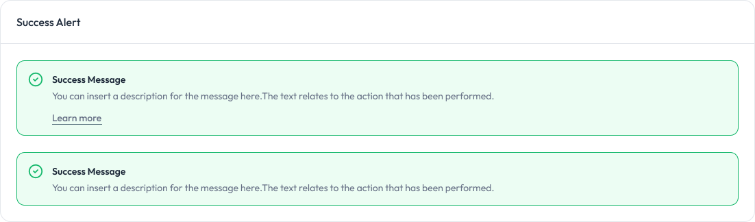
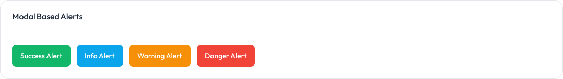
Alert
Alerts are used to provide feedback messages to users.
Preview
Props
Prop | Type | Description | Default |
|---|---|---|---|
| variant | “success” | “error” | “warning” | “info” | Specifies the type of alert. Determines styles and icon. | ”info” |
| title | string | The main title of the alert. | "" |
| message | string | The detailed message of the alert. | "" |
| showLink | boolean | Whether to display the “Learn More” link. | false |
| linkHref | string | The URL the “Learn More” link points to. | ”#“ |
| linkText | string | The text displayed for the “Learn More” link. | ”Learn more” |
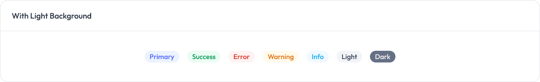
Badge
Badges are used to display small status indicators, counts, or labels.
Preview
Props
Prop | Type | Default | Description |
|---|---|---|---|
| variant | ”light” | “solid" | "light” | Visual style of the badge |
| size | ”sm” | “md" | "md” | Size of the badge |
| color | “primary” | “success” | “error” | “warning” | “info” | “light” | “dark" | "primary” | Color of the badge |
startIcon | html string | - | Icon at the start of the badge |
| endIcon | html string | - | Icon at the end of the badge |
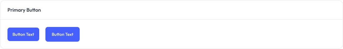
Button
Button are used to trigger actions, submit forms, or navigate within the application.
Preview
Props
Prop | Type | Default | Description |
|---|---|---|---|
size | ”sm” | “md" | "md” | Defines the button size. Options: |
variant | “primary” | “outline" | "primary” | Button style variant. Options: |
startIcon | html string | — | Optional icon displayed before the button text. |
endIcon | html string | — | Optional icon displayed after the button text. |
disabled | boolean | false | Disables the button and applies a “disabled” style. |
className | string | "" | Additional custom classes for styling. |
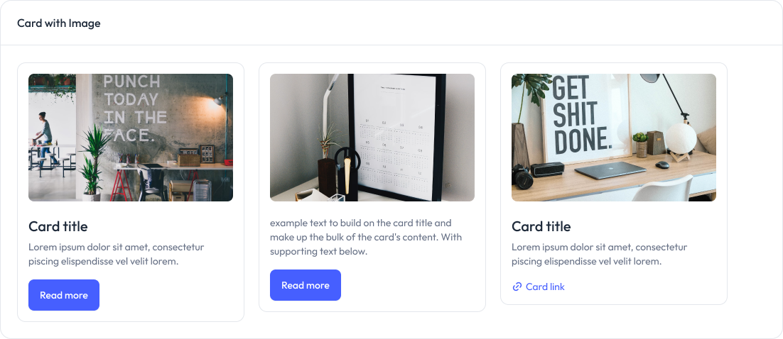
Card
Cards are used to display content and actions related to a single subject.
Preview
Props
Prop | Type | Default | Description |
|---|---|---|---|
| image | string | null | URL of the image to display at the top of the card. |
| title | string | null | The title of the card. |
description | string | null | The description text of the card. |
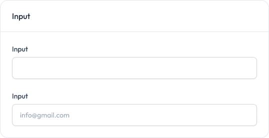
Input
Input fields allow users to enter text, passwords, and other data.
Preview
Props
Prop | Type | Default | Description |
|---|---|---|---|
| label | string | null | Label for the input field |
| name | string | Required | Name attribute for the input |
| type | string | ”text” | Input type (text, password, email, etc.) |
placeholder | string | "" | Placeholder text |
required | boolean | false | Whether the field is required |
disabled | boolean | false | Whether the field is disabled |
Modal
Modals are used to display content in a layer above the app.
Preview
Props
Prop | Type | Default | Description |
|---|---|---|---|
isOpen | boolean | false | Whether the modal is open by default |
showCloseButton | boolean | true | Whether to show the close button |
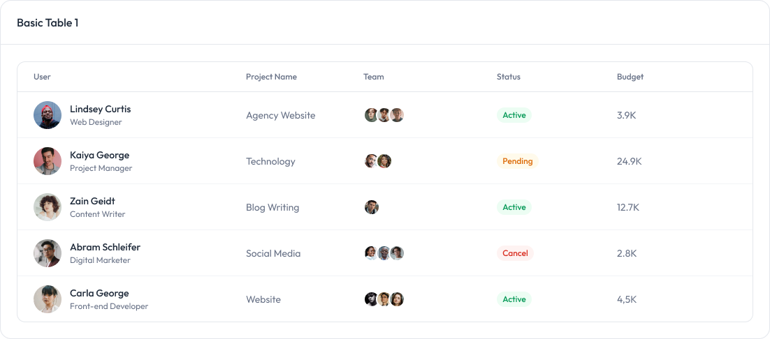
Table
Tables are used to display data in a structured format.
Preview