React Components
TailAdmin React provides a set of fully responsive components to streamline your development process. These components are built with flexibility in mind, allowing you to customize them to fit your project’s needs while maintaining performance and usability.
You can do that easily by following this command.
import ComponentName from "../components/ComponentName";Here are a few examples of the components:
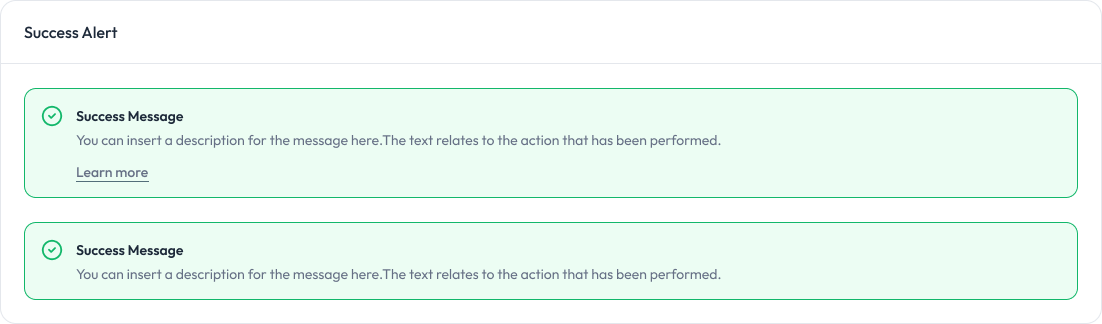
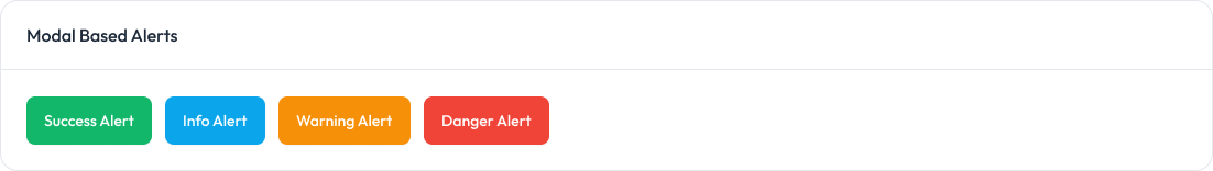
Alert
Alerts are used to provide feedback messages to users.
Preview
Props
Prop | Type | Description | Default |
|---|---|---|---|
| variant | “success” | “error” | “warning” | “info” | Specifies the type of alert. Determines styles and icon. | Required |
| title | string | The main title of the alert. | Required |
| message | string | The detailed message of the alert. | Required |
| showLink | boolean | Whether to display the “Learn More” link. | false |
| linkHref | string | The URL the “Learn More” link points to. | ”#“ |
| linkText | string | The text displayed for the “Learn More” link. | ”Learn more” |
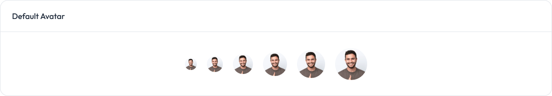
Avatar
Avatars are used to display a user’s profile image or initials.
Preview
Props
Prop | Type | Description | Default |
|---|---|---|---|
| src | string | The URL of the avatar image. | Required |
| alt | string | Alt text for the avatar image. | ”User Avatar” |
| size | “xsmall” | “small” | “medium” | “large” | “xlarge” | “xxlarge” | Determines the size of the avatar. | ”medium” |
| status | “online” | “offline” | “busy” | “none” | Displays a status indicator on the avatar. | ”none” |
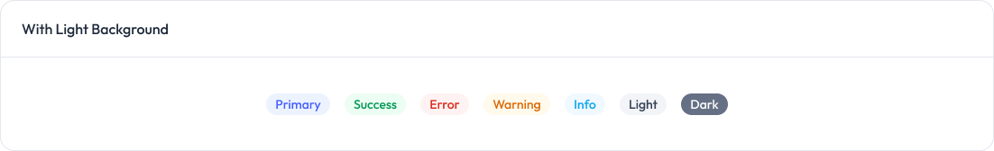
Badge
Badges are used to display small status indicators, counts, or labels.
Preview
Props
Prop | Type | Default | Description |
|---|---|---|---|
| variant | ”light” | “solid" | "light” | Visual style of the badge |
| size | ”sm” | “md" | "md” | Size of the badge |
| color | “primary” | “success” | “error” | “warning” | “info” | “light” | “dark" | "primary” | Color of the badge |
startIcon | React.ReactNode | - | Icon at the start of the badge |
| endIcon | React.ReactNode | - | Icon at the end of the badge |
children | React.ReactNode | Required | Content inside the badge |
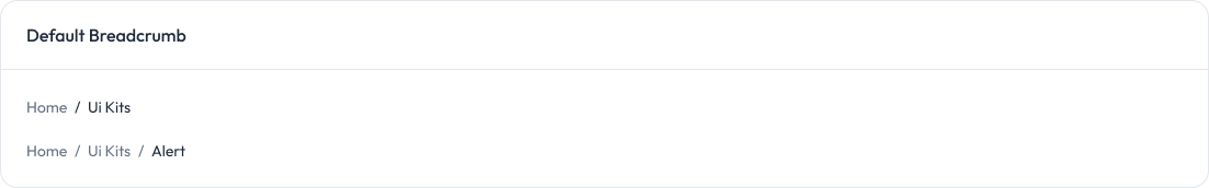
Breadcrumb
Breadcrumbs are used to display navigation paths and help users track their location within a website.
Preview
Props
Prop | Type | Default | Description |
|---|---|---|---|
items | BreadcrumbItem[] | Required | An array of breadcrumb items to be displayed. Each item represents a level in the breadcrumb hierarchy. |
variant | “default” | “withIcon” | “dotted” | “chevron” | “default” | Determines the visual style of the breadcrumb, affecting separators and icon display. |
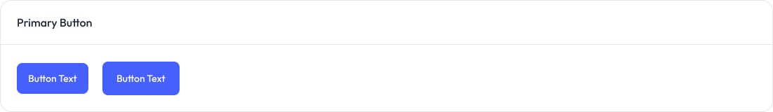
Button
Button are used to trigger actions, submit forms, or navigate within the application.
Preview
Props
Prop | Type | Default | Required | Description |
|---|---|---|---|---|
children | ReactNode | — | ✅ | The content inside the button, typically text or elements. |
size | ”sm” | “md" | "md” | optional | Defines the button size. Options: |
variant | “primary” | “outline" | "primary” | optional | Button style variant. Options: |
startIcon | ReactNode | — | optional | Optional icon displayed before the button text. |
endIcon | ReactNode | — | optional | Optional icon displayed after the button text. |
onClick | () => void | — | optional | Click handler function triggered on button click. |
disabled | boolean | false | optional | Disables the button and applies a “disabled” style. |
className | string | "" | optional | Additional custom classes for styling. |
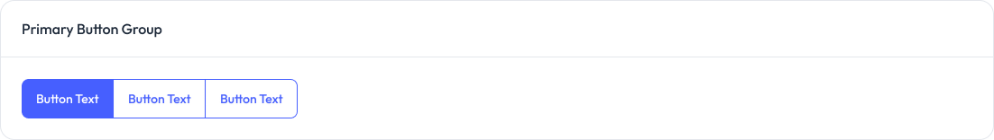
Button Group
Button groups are used to group related actions together for better organization and user interaction.
Preview
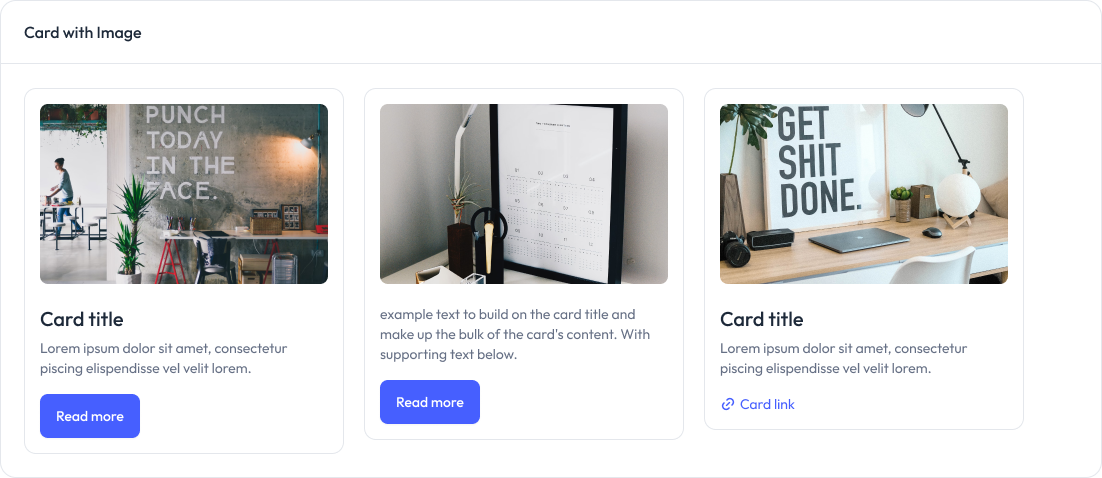
Card
Cards are used to display content and actions related to a single subject in a structured and visually appealing way.
Preview
Props
| Component | Prop | Type | Description | Default |
|---|---|---|---|---|
| Card | children | ReactNode | Content to be displayed inside the card. | None |
| CardTitle | children | ReactNode | Title text for the card. Typically a short, descriptive heading. | Required |
| CardDescription | children | ReactNode | Descriptive text providing additional context for the card. | Required |
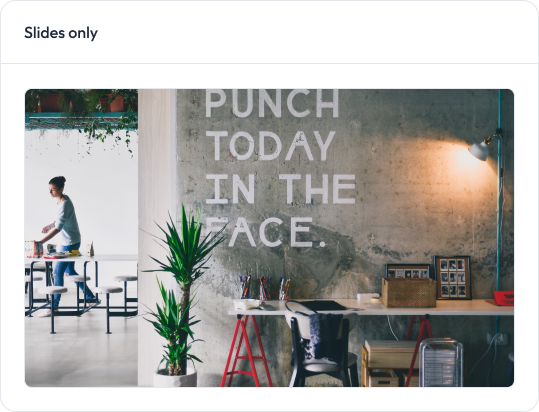
Carousel
Carousels are used to showcase multiple pieces of content in a sliding, interactive format.
Preview
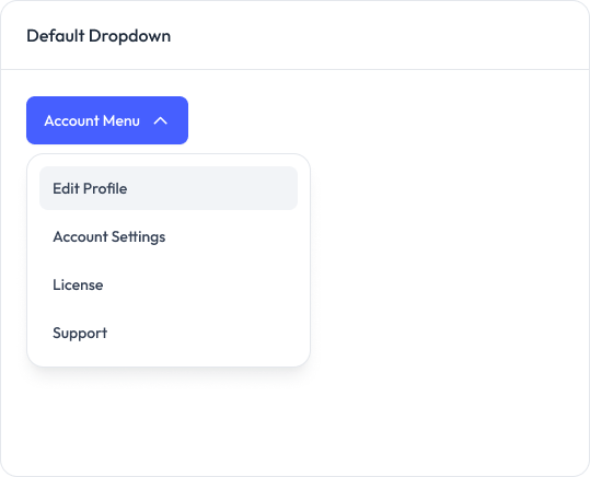
Dropdown
Dropdowns are used to display a list of options or actions in a compact, interactive menu.
Preview
Props
Dropdown Props
Prop | Type | Default | Description |
|---|---|---|---|
isOpen | boolean | Required | Controls the visibility of the dropdown |
onClose | () => void | Required | Function to call when the dropdown should be closed |
children | React.ReactNode | Required | The content of the dropdown (usually DropdownItems) |
className | string | "" | Additional CSS classes to apply to the dropdown container |
DropdownItem Props
Prop | Type | Default | Description |
|---|---|---|---|
| tag | ”a” | “button" | "button” | Determines whether the item renders as a link or a button |
| href | string | undefined | The URL for the link (only used when tag=“a”) |
| onClick | () => void | undefined | Function to call when the item is clicked |
onItemClick | () => void | undefined | Function to call when the item is clicked (usually to close the dropdown) |
baseClassName | string | “block w-full text-left px-4 py-2 text-sm text-gray-700 hover:bg-gray-100 hover:text-gray-900” | Base CSS classes for the item |
className | string | "" | Additional CSS classes to apply to the item |
children | React.ReactNode | Required | The content of the dropdown item |
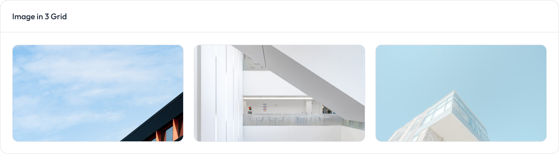
Images
Images are used to display visual content, enhance user experience, and communicate information effectively.
Preview
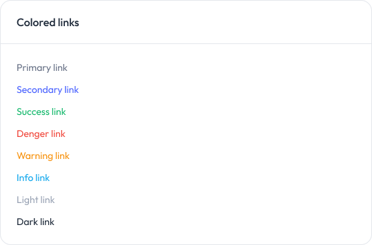
Links
Custom links are used to navigate between pages or perform actions while allowing for customized styles and behaviors.
Preview
Props
Prop | Type | Default | Description |
|---|---|---|---|
| href | string | Required | URL the link points to |
children | React.ReactNode | Required | Content inside the link |
| variant | ‘default’ | ‘colored’ | ‘underline’ | ‘opacity’ | ‘opacityHover' | 'default’ | Visual style of the link |
| color | ‘primary’ | ‘secondary’ | ‘success’ | ‘danger’ | ‘warning’ | ‘info’ | ‘light’ | ‘dark' | 'primary’ | Color of the link (for ‘colored’ and ‘underline’ variants) |
| opacity | 10 | 25 | 50 | 75 | 100 | 100 | Opacity of the link (for ‘opacity’ and ‘opacityHover’ variants) |
className | string | ” | Additional CSS classes |
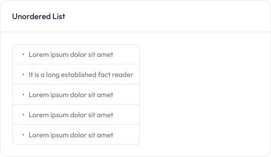
List
Preview
Modal
Modals are used to display content or actions in a popup overlay, typically for focused user interaction without navigating away from the current page.
Preview
Props
Prop | Type | Default | Description |
|---|---|---|---|
isOpen | boolean | - | Controls the visibility of the modal |
onClose | () => void | - | Function to call when the modal should be closedmodal |
children | React.ReactNode | - | Content to be rendered inside the modal |
className | string | - | Additional CSS classes to apply to the modal |
showCloseButton | boolean | true | Controls the visibility of the close button |
isFullscreen | boolean | false | When true, the modal takes up the full screen |
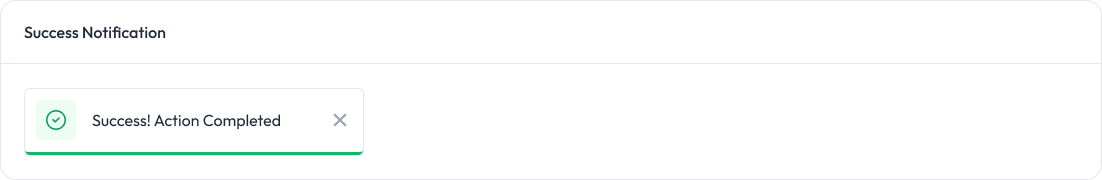
Notification
Notifications are used to alert users about important updates, events, or actions in the application.
Preview
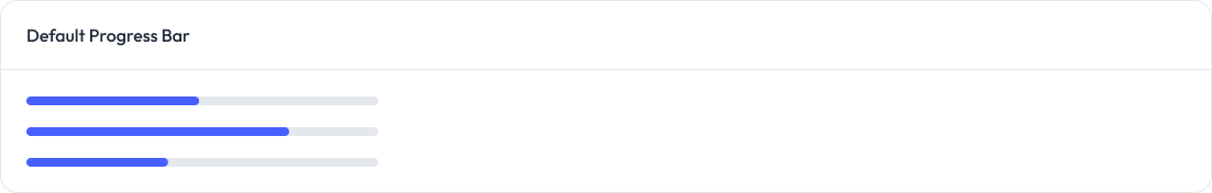
ProgressBar
Progress bars are used to visually indicate the completion status of a task or process.
Preview
Props
Prop | Type | Default | Description |
|---|---|---|---|
progress | number | Required | The progress value (0-100) |
size | ‘sm’ | ‘md’ | ‘lg’ | ‘xl’ | ‘sm’ | The size of the progress bar |
label | ‘none’ | ‘outside’ | ‘inside’ | ‘none’ | The position of the label |
className | string | "" | Additional CSS classes |
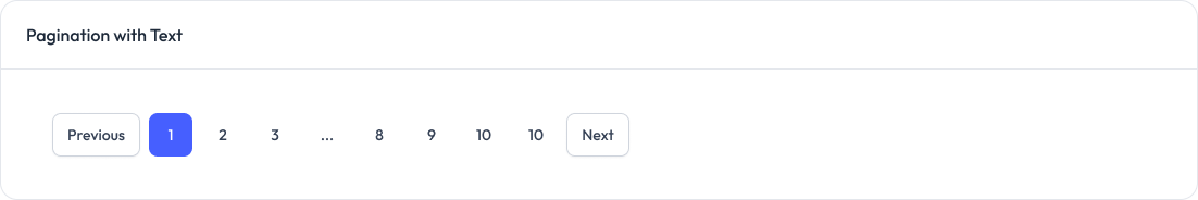
Pagination
Pagination is used to divide content into separate pages, allowing users to navigate through large datasets or lists efficiently.
Preview
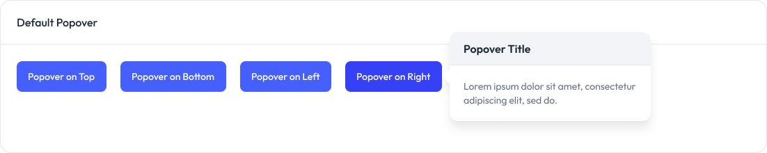
Popover
The Popover component displays floating content next to a trigger element. It’s useful for displaying additional information or controls without cluttering the main interface.
Preview
Props
Prop | Type | Description | Default |
|---|---|---|---|
position | “top” | “right” | “bottom” | “left” | The position of the popover relative to the trigger | Required |
trigger | React.ReactNode | The element that triggers the popover | Required |
children | ReactNode | The content to be displayed inside the popover | Required |
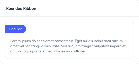
Ribbons
Ribbons are used to highlight or label content with a decorative or attention-grabbing tag, often indicating special status or importance.
Preview
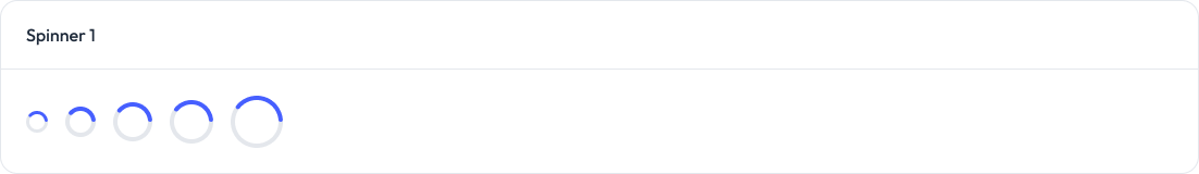
Spinner
Spinners are used to indicate that a process is ongoing or content is loading, providing visual feedback to users.
Preview
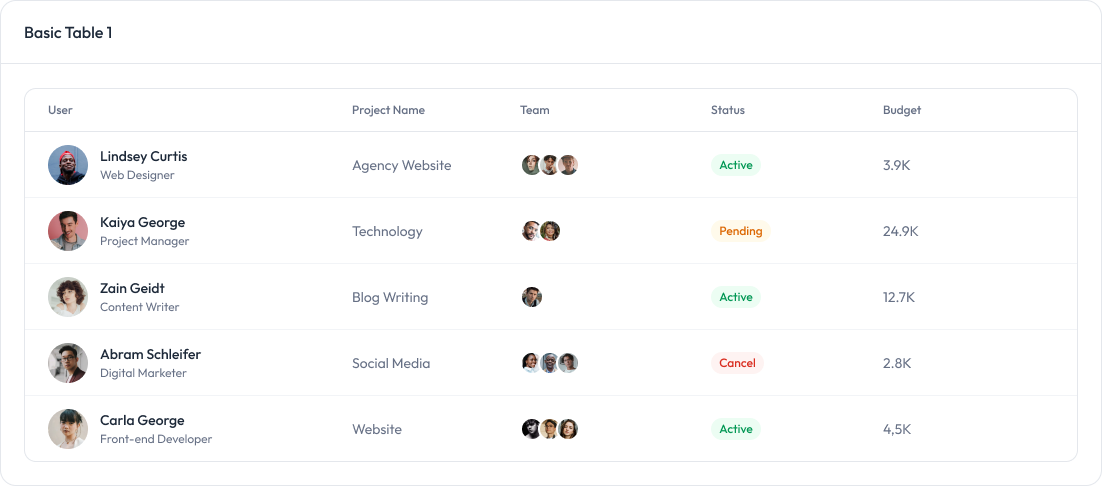
Table
The table component is used to display data in a structured, tabular format with customizable rows, columns, and styles.
Preview
Props
Component | Prop | Type | Default | Description |
|---|---|---|---|---|
| Table | children | ReactNode | Required | Table content (thead, tbody, etc.) |
| Table | className | string | - | Optional className for styling |
TableHeader | children | ReactNode | Required | Header row(s) |
TableHeader | className | string | - | Optional className for styling |
| TableBody | children | ReactNode | Required | Body row(s) |
| TableBody | className | string | - | Optional className for styling |
| TableRow | children | ReactNode | Required | Cells (th or td) |
| TableRow | className | string | - | Optional className for styling |
| TableCell | children | ReactNode | Required | Cell content |
| TableCell | isHeader | boolean | false | If true, renders as <th>, otherwise <td> |
| TableCell | className | string | - | Optional className for styling |
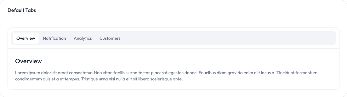
Tabs
Tabs are used to organize content into separate sections, allowing users to switch between different views or categories seamlessly.
Preview
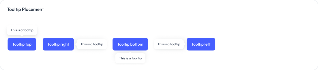
Tooltips
Tooltips are used to provide additional information or hints when a user hovers over or interacts with an element.
Preview
Props
Prop | Type | Description | Default |
|---|---|---|---|
children | ReactNode | The element that triggers the tooltip on hover | Required |
content | string | The text content of the tooltip | Required |
position | “top” | “right” | “bottom” | “left” | The position of the tooltip relative to the trigger element | “top” |
theme | “light” | “dark” | The color theme of the tooltip | “light” |
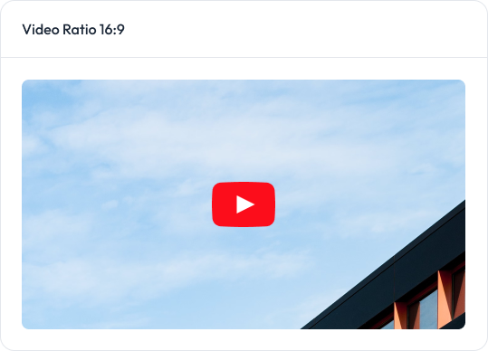
Videos
Video components are used to embed and display video content, allowing users to view multimedia within the application.
Preview
Props
Prop | Type | Default | Description |
|---|---|---|---|
videoId | string | Required | The YouTube video ID to embed |
aspectRatio | ‘16:9’ | ‘4:3’ | ‘21:9’ | ‘1:1’ | ‘16:9’ | The aspect ratio of the embedded video |
title | string | ‘YouTube video’ | The title attribute for the iframe |
className | string | ” | Additional CSS classes for the container |