Form Elements
TailAdmin provides a set of pre-designed form elements to help you create functional and user-friendly forms quickly. These elements can be customized with various props to suit your specific needs.
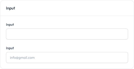
Input
A customizable input field for text, email, password, and other types of data entry.
Preview
Props
Prop | Type | Default | Description |
|---|---|---|---|
| type | “text” | “number” | “email” | “password” | “date” | “time” | string | ”text” | Type of the input field |
| id | string | - | ID for the input element |
| name | string | - | Name attribute for the input |
placeholder | string | - | Placeholder text for the input |
| value | string | number | - | Current value of the input |
| onChange | (e: React.ChangeEvent<HTMLInputElement>) => void | - | Function to handle input changes |
| className | string | "" | Additional CSS classes for the input |
| min | string | - | Minimum value for number inputs |
| max | string | - | Maximum value for number inputs |
| step | number | - | Step value for number inputs |
| disabled | boolean | false | Whether the input is disabled |
| success | boolean | false | Whether to show success state |
| error | boolean | false | Whether to show error state |
| hint | string | - | Optional hint text displayed below the input |
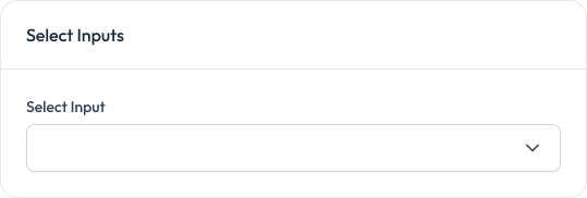
Select
A dropdown selects input to choose from a list of options.
Preview
Props
Prop | Type | Default | Description |
|---|---|---|---|
| options | Option[] | Required | Array of option objects with value and label properties |
placeholder | string | ”Select an option” | Placeholder text for the select input |
| onChange | (value: string) => void | Required | Function to handle value changes |
| className | string | "" | Additional CSS classes for the select input |
defaultValue | string | "" | Default selected value |
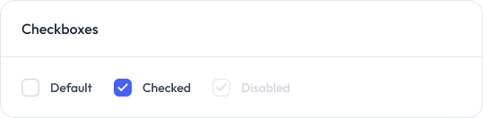
Checkbox
A toggleable checkbox input to represent a true/false value.
Preview
Props
| Prop | Type | Default | Description |
|---|---|---|---|
| label | string | - | Optional label for the checkbox |
| checked | boolean | Required | Checked state of the checkbox |
| className | string | "" | Additional CSS classes for the checkbox |
| id | string | - | Unique ID for the checkbox |
| onChange | (checked: boolean) => void | Required | Change handler for the checkbox |
| disabled | boolean | false | Disabled state of the checkbox |
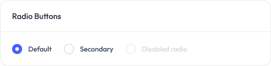
Radio
A set of radio buttons for selecting one option from a group.
Preview
Props
Prop | Type | Default | Description |
|---|---|---|---|
| id | string | Required | Unique ID for the radio button |
| name | string | Required | Radio group name |
| value | string | Required | Value of the radio button |
| checked | boolean | Required | Whether the radio button is checked |
| label | string | Required | Label for the radio button |
| onChange | (value: string) => void | Required | Handler for value change |
| className | string | "" | Optional additional classes |
| disabled | boolean | false | Optional disabled state for the radio button |
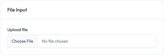
File Upload
A file input for allowing users to upload files to your application.
Preview
Props
Prop | Type | Default | Description |
|---|---|---|---|
| className | string | undefined | Additional CSS classes for the file input |
| onChange | (event: React.ChangeEvent<HTMLInputElement>) => void | undefined | Function to handle file selection changes |