HTML Components
TailAdmin HTML offers a variety of customizable components designed to enhance the user interface and improve the overall experience of your web application. These components are fully responsive, easy to integrate, and can be tailored to meet your specific design needs.
Below are a few examples of the components:
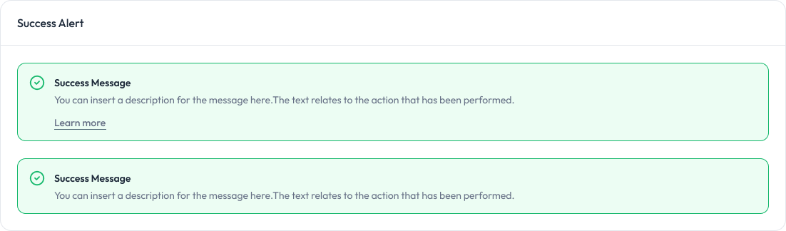
Alert Component:
Alerts are used to provide feedback messages to users.
Preview
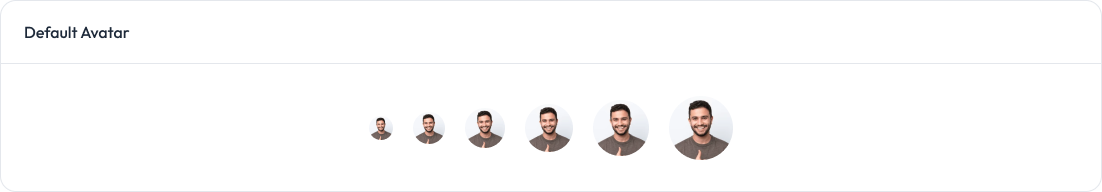
Avatar Component:
Avatars are used to display a user’s profile image or initials.
Preview
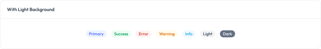
Badge Component:
Badges are used to highlight information or status.
Preview
Buttons Component:
Buttons allow users to take actions, and make choices, with a single tap.
Preview
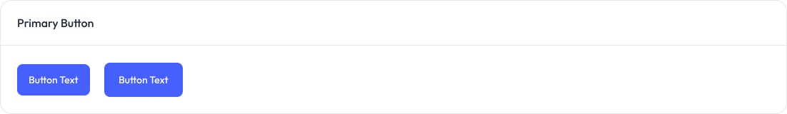
Chart Component:
Charts are used to visualize data in a graphical format.
<!-- Chart 01 (Monthly Sales) -->
<div
  class="overflow-hidden rounded-2xl border border-gray-200 bg-white px-5 pt-5 dark:border-gray-800 dark:bg-white/[0.03] sm:px-6 sm:pt-6"
>
  <div class="flex items-center justify-between">
    <h3 class="text-lg font-semibold text-gray-800 dark:text-white/90">
      Monthly Sales
    </h3>
    <!-- Dropdown menu -->
  </div>
  <div class="custom-scrollbar max-w-full overflow-x-auto">
    <div
      id="chartOne"
      class="-ml-5 h-full min-w-[650px] pl-2 xl:min-w-full"
    ></div>
  </div>
</div>

<!-- Chart 02 (Monthly Target) -->
<div
  class="rounded-2xl border border-gray-200 bg-gray-100 dark:border-gray-800 dark:bg-white/[0.03]"
>
  <div
    class="shadow-default rounded-2xl bg-white px-5 pb-11 pt-5 dark:bg-gray-900 sm:px-6 sm:pt-6"
  >
    <div class="flex justify-between">
      <div>
        <h3 class="text-lg font-semibold text-gray-800 dark:text-white/90">
          Monthly Target
        </h3>
        <p class="text-theme-sm mt-1 text-gray-500 dark:text-gray-400">
          Target you’ve set for each month
        </p>
      </div>
      <!-- Dropdown -->
    </div>
    <div class="relative max-h-[195px]">
      <div id="chartTwo" class="h-full"></div>
      <span
        class="absolute left-1/2 top-[85%] -translate-x-1/2 -translate-y-[85%] rounded-full bg-success-50 px-3 py-1 text-xs font-medium text-success-600 dark:bg-success-500/15 dark:text-success-500"
        >+10%</span
      >
    </div>
  </div>
</div>
Grid Image Component:
Grid Images are used to display a collection of images in a grid layout.
Preview

Metric Group Component:
Metric Groups display key statistics or metrics.
<!-- Metric Group 01 -->
<div class="grid grid-cols-1 gap-4 sm:grid-cols-2 md:gap-6">
  <div
    class="rounded-2xl border border-gray-200 bg-white p-5 dark:border-gray-800 dark:bg-white/[0.03] md:p-6"
  >
    <div
      class="flex h-12 w-12 items-center justify-center rounded-xl bg-gray-100 dark:bg-gray-800"
    >
      <!-- Icon SVG -->
    </div>
    <div class="mt-5 flex items-end justify-between">
      <div>
        <span class="text-sm text-gray-500 dark:text-gray-400">Customers</span>
        <h4
          class="text-title-sm mt-2 font-bold text-gray-800 dark:text-white/90"
        >
          3,782
        </h4>
      </div>
      <span
        class="flex items-center gap-1 rounded-full bg-success-50 py-0.5 pl-2 pr-2.5 text-sm font-medium text-success-600 dark:bg-success-500/15 dark:text-success-500"
      >
        <!-- Arrow Icon -->
        11.01%
      </span>
    </div>
  </div>
</div>
Profile Component:
Profile components, including modals for editing information.
Preview
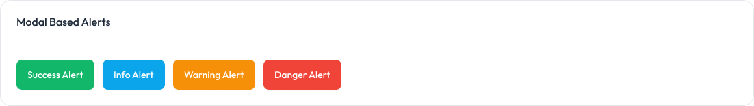
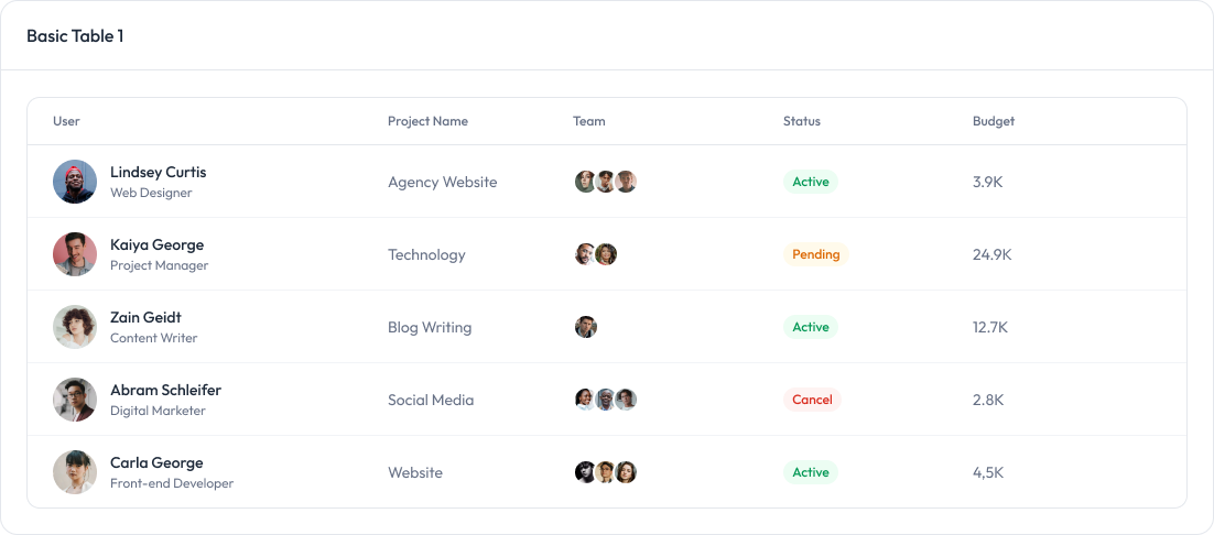
Table Component:
tables are used to display data in a structured format.
Preview
Video Component:
Video components for embedding videos with various aspect ratios.
Preview